The blockchain and Web 3 are used to power the text-only social media platform known as Yewniti.
To make the app and website simple to use, I'll demonstrate the newest UI/UX trends in this project while also adhering to my user experience patterns.
A recent survey found that 81% of participants who had heard about Web 3.0 thought it would improve their general happiness and overall wellbeing.
Because most other social media platforms, including Instagram, Facebook, Tiktok, and others, aren't extremely secure with their users' data, Yewniti will stand out. Since this platform is powered by Web 3, all shared information is kept on a public blockchain that is encrypted.
RESEARCH
Open
User Persona
Researching the user's needs, background, demographics, preferences, and other factors is essential before beginning the wireframes. This method makes it simpler to decide how to develop our app based on the target audience.
Researching the user's needs, background, demographics, preferences, and other factors is essential before beginning the wireframes. This method makes it simpler to decide how to develop our app based on the target audience.
James Fergusson
According to the findings of a recent survey, 20% of Gen Zers and 18% of Millennials are aware of Web3, compared to 11% of Gen Xers and only 8% of Boomers.
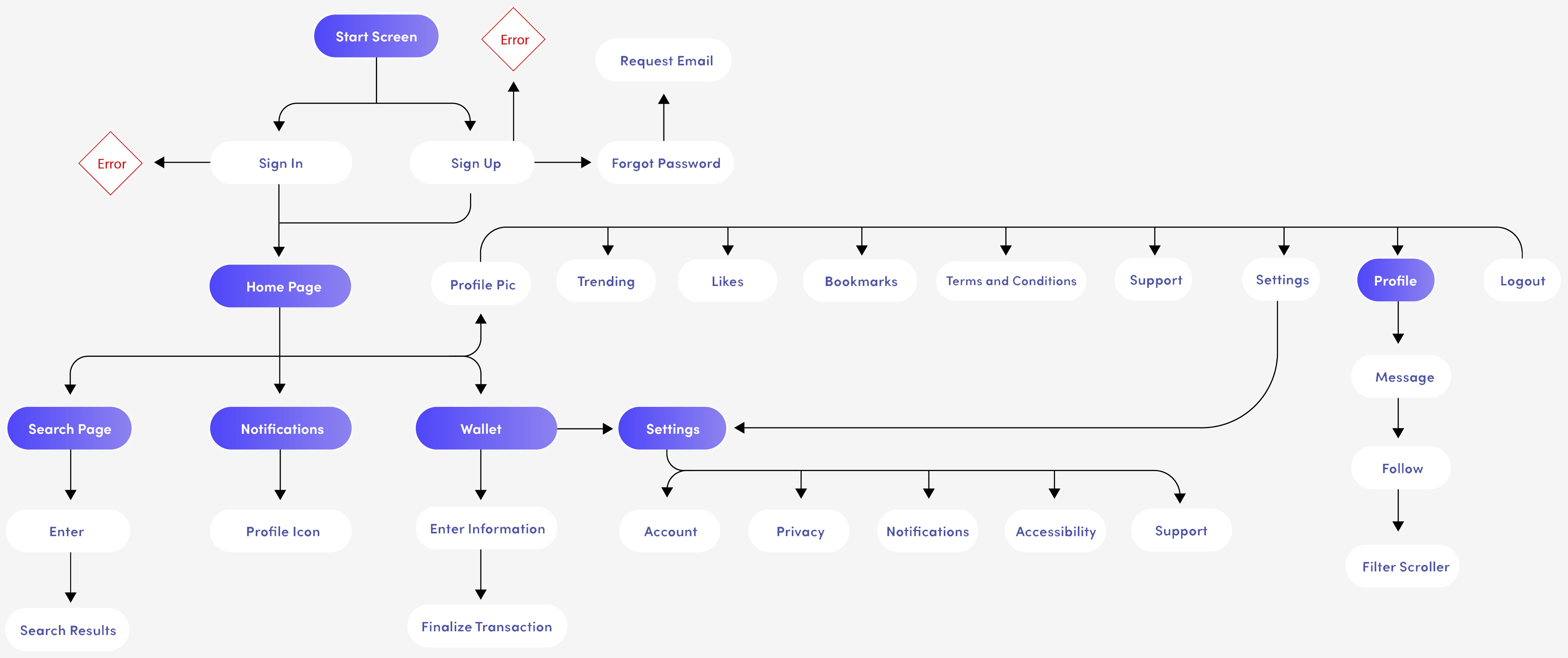
User Flow
Creating the user flow was essential in order to find out which user patterns were the most convenient before designing the wireframes.

BRANDING
Open
Final Logo
In order to adhere to the most recent design trends, the logo is sleek and contemporary. It is crucial for the logo to reflect the company's commitment to becoming an innovative platform.

PROTOTYPES
Open
Low Fidelity
I started making the low fidelity wireframes for the app after finishing the user research. The style and direction of the app needed to be determined at this stage.

Adapting To Mobile
The final app prototype I produced throughout the entire process is user-friendly and adheres to a pleasing design aesthetic.


Desktop UI
An excellent rebrand is visible in the new front end website design. More rounded elements, subtle gradients, and forms are used here to give the website a great, contemporary feel. Additionally, the colours are subdued, giving the website a fresh and modern appearance. To make each area easier to recognize, extra icons are also used.


FEATURES
Accessibility
I've added a dark mode for the app and website because accessibility is crucial for a positive user experience on any website and mobile application.